For a TL;DR, see the end of the post.
A bit of context
I found that this month electric bill is 25% higher than last year. I’d like to find out why. Before starting to investigate I thought about the following reasons:
- We consumed more
- We produced less (we have solar panels)
What is the situation ?
There are a few things you need to know before we go to the main topic. We read the meters every month and the electricity provider bills us based on the readings. We have solar panels installed on the roof. They generate electricity which is used by the house. If we produce more than we consume, then the electricity is used to heat the water (up to ~60°, we don’t want boiling water). If we still produce more than we consume, then we sell the remaining power to the grid.
Collecting the data
There are two sources from which we can get the data, but each comes with some problems.
The website of the electricity provider
On their website we can see how much electricity we bought each month. We can’t see how much we produced or see the value for a shorter period (i.e. how much we consume each week). We have the values for each month since 2014. The value is an integer in kWh.
The solar panels
There is an app showing how much we produced, how much we consumed and how much we imported from the grid. The values are float (2 digits after decimal point), in Wh not in kWh, and we have a reading every 15 minutes. We installed the panels in 2015 therefore the readings for the production starts there, but the readings for the consumption are only available since 2017.
Fun fact, when there is a blackout, the solar panels are stopped and there is no electricity generated. This is because when the electricity provider cuts the power to do some work, they don’t want us to still have power.
Therefore, we have two data sources, each with different starting time and precision.
Extracting the data from the dashboard
The company provides an HTML carousel than spans 11k pixels in order to show the data, it’s ugly ! But hey, it’s easy to scrape!
I saved the HTML page and started to analyse the structure of the HTML. Here is how it looks like:

I added on top of some month the CSS class associated with the bar. We can see that the month is numbered with the smaller number being the more recent month and the number keep growing after 12 months.
OK, let’s try to parse it. Here is the code for a bar in the graph.
|
|
We can see the consumption in the span tag. In the div’s class there is its month number we can parse everything and obtain the consumption per month. I did it for you and…
After checking the gathered values, they seem to be correct. It might have been faster to copy the data by hand but hey it’s not that much work and I can re-download the HTML page and re-compute the data now.
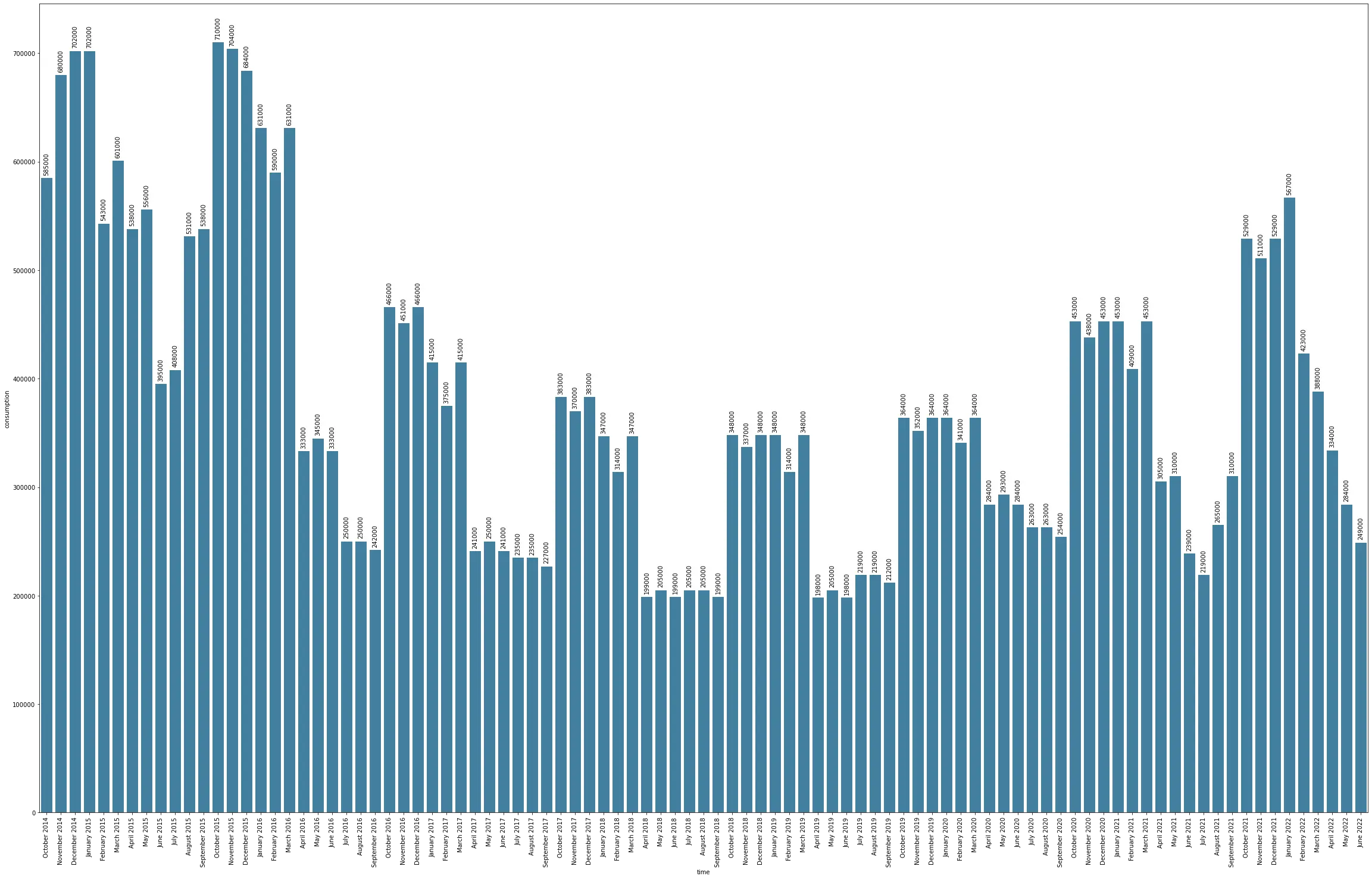
Let’s have a look (looks better without the dark theme)

We can see that the consumption is decreasing, but it starts to grow again.
Did the consumption increase create the 25% increase in the bill ?
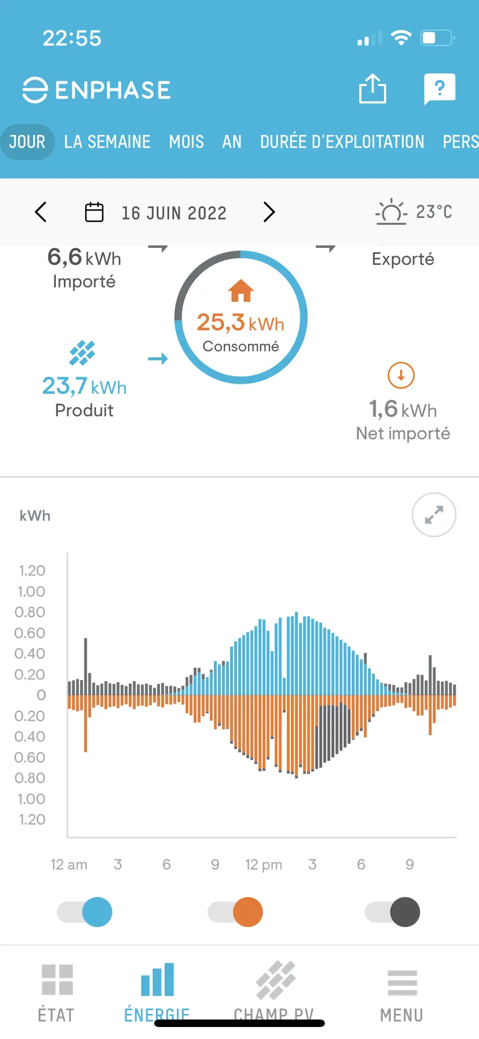
Can we compare it with the production ? Well, the production is only available through the solar panels’ app, here is how it looks like:

Awesome ! Right ? Well no, we have 96 readings per day, and we have reading since 2016. We need a way to export the data, unfortunately the data is not available in a CSV format. They have an API, but the free plan is 10 hits per minute and 1,000 hits per month. I have 96 data points per day and ~30 days a month = 96*30 =~ 2880 request. They might offer a way to retrieve data in bulk which might fit in the free plan. But i don’t like to pay for my own data so let’s do it another way!
Let’s use the app and capture the data flowing on the network. I’m using an iPhone, so I installed a certificate on it, launched burp suite on my laptop and saw how the app is requesting the data. And just like that I did the same:
|
|
I filled the cookies and headers etc. to have access to my data. Long story short, I now have a JSON object with the data. Here it is.
|
|
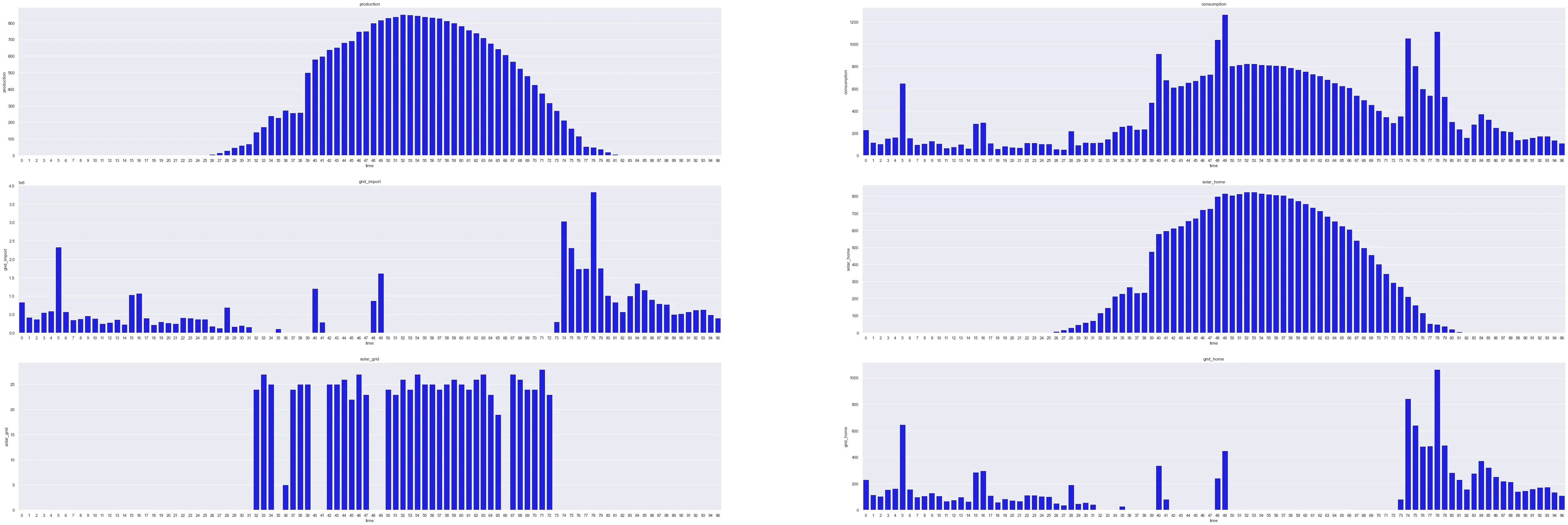
Each JSON object in the stats array is a day with 96 readings in each field. Most of the field are useless (grid_battery for example) because it’s an equipment we simply don’t have this field is empty. We have 96 value for the equipment we have installed. Here is the graph of the field we are interested in.

We can see that the consumption = gridhome + solar_home and grid_import = grid_home because we don’t have batteries. The fields are named using the source of the electricity followed by an underscore and the destination. But I checked and this value is always (for me) 3600 times the _grid_home value.
Easy, we are finished now right ? NO ! The disaster continues ! I knew the jokes about timezone and the headache about time but, I’m not working with timezone, so everything should be juuuust right.
I found this great list a bit too late. But basically. A day isn’t always 24h. For me, it means that I don’t have 96 value, I sometimes have 96 + 4 and sometimes 96 - 4. Furthermore, February can’t be compared with another February from another year because it’s not always 28 days. That’s not all !
When there is no production like during the night, the value is 0, but where there is no production like during a blackout the value is null. Therefore, I did a tiny bit of data cleaning.
|
|
ffill means forward fill, it will take the previous value and put it in the null value.
Blackout are extremely rare where I live (we’ll see this winter but that’s another topic). Therefore, I’m not going to fill the missing value with a value from 3 hours ago.
Unfortunately we only have the production from 2016, starting July 2017 we have production and the consumption! (again, dark theme is worst, I’ll fix it for a future post) I added some 0 value at the start of the solar panels’ data so the data from the solar panels and from the website lined up correctly, then summed by month and plotted both on the same graph.
- Red is data obtained from the electricity provider
- Blue is data obtained from the solar panels
- Purple is the mix of the two
The growing trend is clearly visible. The consumption is growing in both dataset. We can now ask ourselves, did we consume more electricity because we produce less ? Can we pinpoint a day when our consumption changed ?
The answer to the second question is no, the variance in the data from one day to the other is too big, I tried looking at whole week/month instead but same result.
To answer the first question we can look at the production data from the solar panels.
Did we produce less ?
In order to answer this, we can plot the production month by month just like we did with the consumption. (I fixed the dark theme for this one)
Conclusion
We’ve seen that we simply consume more each year and that the production is steady. Furthermore, I want to note that my solar panel from half a decade ago are doing fine and producing as much as they used to.
TL;DR
We consume more power each year, but the consumption didn’t explode at a specific time, it’s a steady increase. Furthermore, the production of the solar panel didn’t increase nor decrease.

